

Introduction
In a world where most websites struggle with the same glaze of pastel colors, rounded edges, and smooth animations, a design emerges that says: "I won't look like all the others." Brutalism in web design is a trend that consciously rejects modern aesthetic conventions, returning to the raw, unprocessed reality of internet structure. This is not a designer's incompetence — this is policy. This is not a lack of time — this is a choice.
For freelance web developers working in Poland, brutalism represents both an opportunity and a challenge. An opportunity because it allows you to stand out in a competitive market. A challenge because it requires understanding the boundaries between innovative boldness and real user problems. The question that professionals ask themselves in 2026 is not "should I use brutalism?", but rather "where and how can I do it responsibly?"
History: When the Concrete Block Spilled Over to the Internet
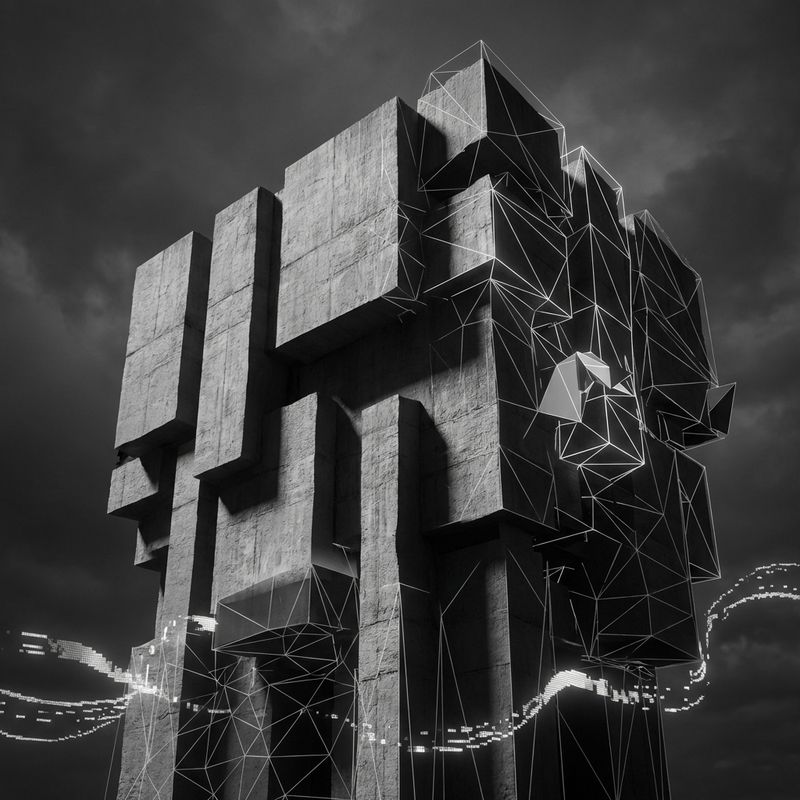
To understand digital brutalism, we must reach back to its architectural roots. In the 1950s, right after World War II, Great Britain faced the problem of rebuilding cities destroyed by bombing. Designers and architects sought a cheap, fast, and time-resistant construction method. The answer was what architects Alison and Peter Smithson called in 1950 "new brutalism" — nybrutalism. The term referenced the Swedish prototype and the French word "béton brut," meaning raw concrete.
Brutalist architecture did not hide its nature. Exposed concrete walls, massive geometric forms, lack of ornamentation — all of this evoked an impression of raw honesty and functionality over form. This philosophy quickly spread around the world. Le Corbusier in France, Paul Rudolph in the United States, and later John Andrews in Australia and Canada — all contributed to shaping this movement. In Poland, although it's hard to admit, housing blocks made of large panels are a perfect example of this aesthetic.
For half a century, architectural brutalism dominated, particularly in building public institutions — universities, libraries, courts, theaters. However, by the late 1970s, popularity began to decline. Brutalist buildings began to be associated with times of crisis, negative urbanization, and even totalitarianism. The irony is that this style, which was meant to be a democratic solution for everyone, became forgotten and neglected.
But the story didn't end there. In the digital world, especially in recent years, designers and developers are discovering what architects discovered seven decades earlier: sometimes raw honesty has more power than polished perfection.
What Exactly Is Brutalism in Web Design?
When it comes to definition, brutalism in web design is simultaneously simple and difficult to describe. The simplest definition: it's a design style that consciously rejects modern aesthetic conventions in favor of rawness, functionality, and structural honesty. But this really only tells half the story.
On a practical level, brutalist websites typically contain the following elements:
Typografia na sterydach: Large, bold fonts — sometimes monospace, sometimes sans-serif — that immediately grab attention. These are not thoroughly centered and delicately shaded inscriptions from modern designs; this is text that says "hey, read me, whether you like it or not."
Kolory, które się zderzają: Instead of a curated palette of several harmoniously selected colors, brutalism often reaches for high contrast. Black text on yellow background, white on dark blue, sometimes even — and this is really important — completely monochromatic solutions.
Layout, który ignoruje reguły: Brutalist pages don't follow traditional grid systems. Elements can overlap, space can be uneven, lines can be asymmetric. This is deliberate chaos that always seems to have some purpose.
Minimalny lub nieistniejący CSS: Some brutalist pages almost look like an HTML prototype from the 1990s. Default browser styles. Simple links in blue, data tables instead of nice components.
Nawigacja, która nie słucha: Information hierarchy — the holy grail of modern UX design — is often ignored here. Important things can be hidden, unrelated elements lie next to each other. The user must actively explore and discover.
But this is not accidental ugliness. This is an intentional aesthetic of provocation. The brutalist designer tells the user: "I'm too busy with content to worry about appearance. If you're interested, you have to find your own way."
Brutalism vs. Neo-Brutalism: Recognizing the Difference
Here things get complicated, because not everything that looks brutal is actually brutalism in its pure form. In recent years, a new term has emerged: neo-brutalism (or neubrutalism).
Brutalizm czysty — what we might call "hardcore brutalism" — is faithful to its architectural prototype. Think: a page looks like it was launched in 1993, before CSS even existed.
Neo-brutalizm on the other hand is design that takes the raw aesthetic of brutalism but tempers it with contemporary design practices. It may contain loud colors, but they are deliberately chosen. It may have animations, but they are purposeful. It can be lively and energetic, but without losing structural honesty.
Figma and Gumroad are examples of neo-brutalism.
Notable Examples: Sites That Demand Your Attention
Craigslist, Drudge Report, Figma, Gumroad, Balenciaga, Studio Push.
The Psychology of Brutalism: Why Does It Work?
Novelty Bias, Authenticity and Honesty, Empowerment and Discovery, Emotional Provocation.
Advantages of Brutalism: More Than Just Aesthetics
1. Fast Loading Times and Performance: Brutalist pages typically load faster.
2. Lower Production Costs: No need to produce fancy graphics.
3. Focus on Content: Every word counts.
4. Accessibility for Different Devices: Pages degrade gracefully.
5. Standing Out from Competition: Brutalism stands out.
Disadvantages of Brutalism: Sometimes Pure Evil
Accessibility problems, low conversion for some groups, navigation issues, episodic fashion.
When to Use Brutalism: A Guide to Proper Use Cases
Ideal cases: Creative agencies, art galleries, tech startups, blogs.
Avoid: Finance, older demographics, mainstream e-commerce.
How to Implement Brutalism: Practical Tips for Developers
1. Start with Semantic HTML.
2. Minimal CSS.
3. Typography is King.
4. High Contrast.
Summary
Brutalism is honesty and function over form. Don't be afraid to be raw.